

Why Executives Should Care About Field Service KPIs
For executives running field service organizations, growth and efficiency often come down to one thing: visibility. When your teams are spread across regions, juggling complex schedules, and maintaining thousands of assets, it’s all too easy to lose sight of what’s really happening in the field. Without a single source of truth, decisions get made on gut feel, tribal knowledge, or incomplete spreadsheets. That can cost both revenue and reputation!
The Growth Heroes team has seen this firsthand. One global services enterprise struggled after a major acquisition left it with 12 disconnected subsidiaries, siloed data, and manual processes. Once we helped this company unify their systems on Salesforce, the organization gained the ability to track technician time, asset uptime, and recurring revenue streams in real time. The result? A business where leaders can now make data-driven decisions and see exactly how those changes impact revenue and profitability on live dashboards.
For leaders like you, the question isn’t “Can we measure field service?” – it’s “Are we tracking the right things, in the right way, to drive growth and profitability?”
This blog explores the seven key performance indicators (KPIs) that matter most, and how smart Salesforce dashboards can help you move from reactive firefighting to proactive decision-making.
The 7 Field Service KPIs That Matter Most to Executives
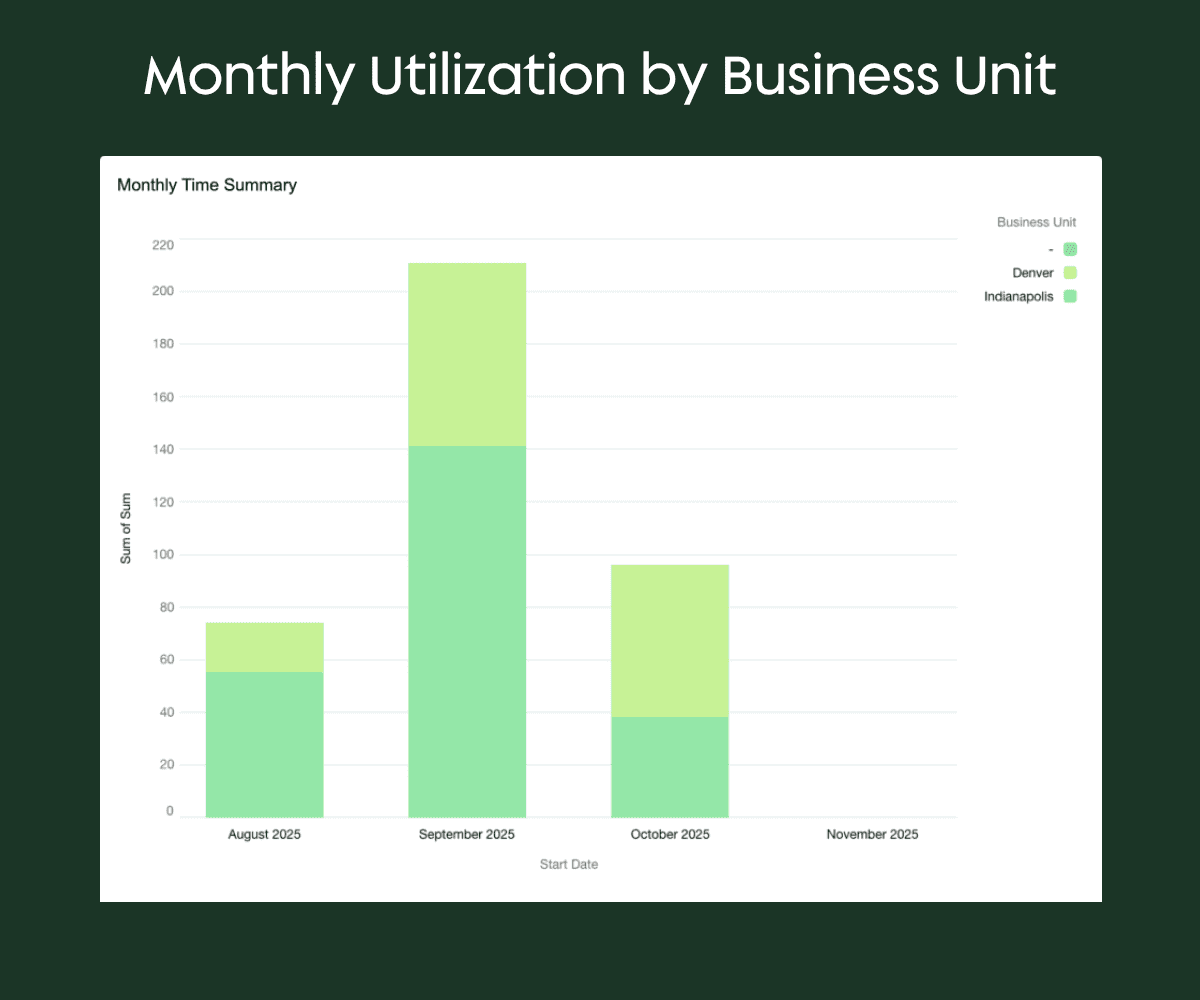
1 - Technician Utilization Rate
What it is: The percentage of technician time spent on billable work compared to total paid hours (payroll).
Why it matters: Utilization is a direct lens into productivity, efficiency, and margin. A low utilization rate could signal wasted payroll, scheduling inefficiencies, or even techs padding timesheets without delivering equivalent customer value. But high utilization, tracked consistently, helps executives align staffing, pricing, and service delivery.
Salesforce dashboard components you might consider:
- Donut Chart: Billable vs. Non-Billable Hours (% split of technician time).
- Bar Chart: Utilization rate by technician (show top/bottom performers).
- Trend Line: Month-over-month technician utilization rate for the past 12 months.
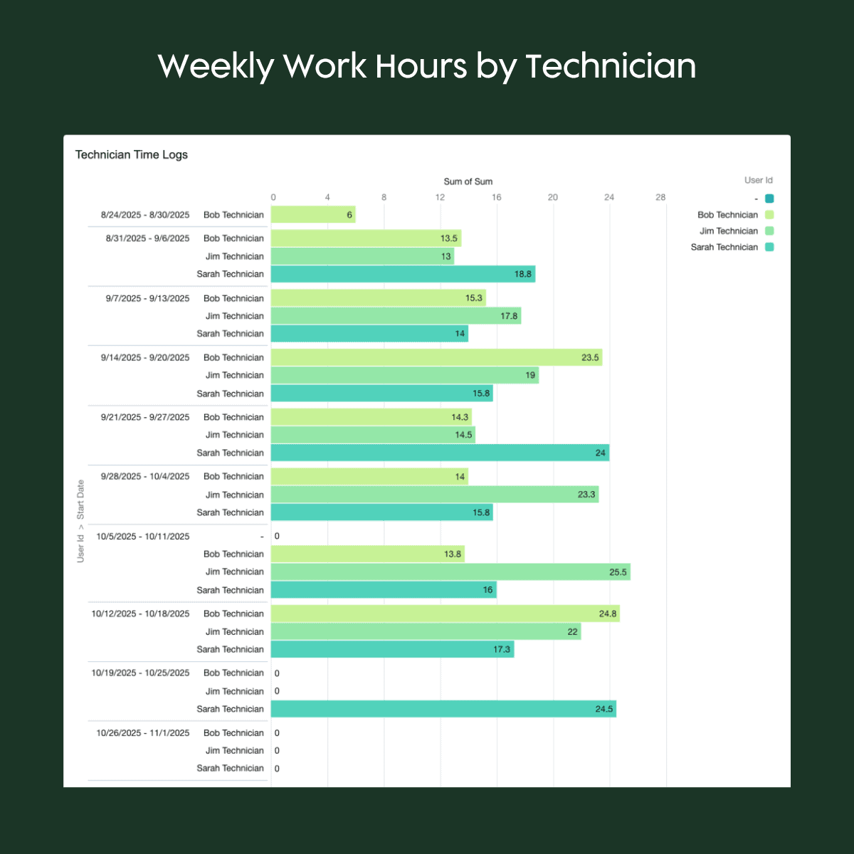
Our team has seen how aligning payroll data with billable hours in Salesforce Field Service can expose thousands of dollars in “ghost overtime.” Once dashboards highlight a mismatch, companies can refine scheduling and have more clarity into true billable time worked. With a connected Dispatch Console and automated work-type assignments, executives can see and fix inefficiencies quickly.
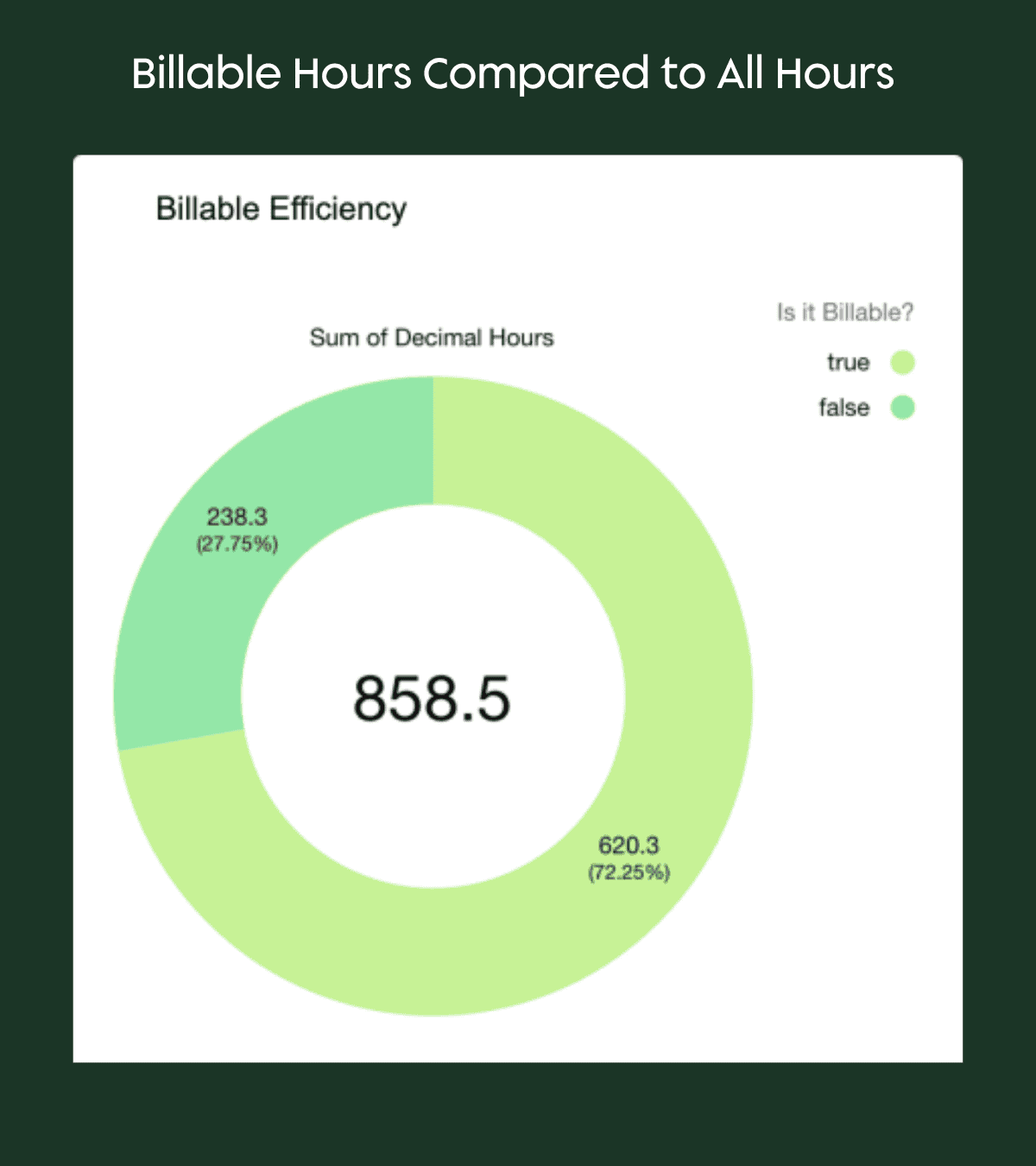
2 - Estimated vs. Actual Work Time…or All Work Hours vs. Billable Hours
What these two work hour-related KPIs measure:
- the difference between either how long a job is expected to take (based on scheduling, work type, or technician input) and how long it actually takes; or,
- the percentage of time that work hours are billable to a client.
Why they matter: These KPIs help executives forecast staffing needs, refine project estimates, and understand where delays occur. When aggregated across regions or work types, they highlight bottlenecks that may be hidden at the job level but costly when aggregated.
Salesforce dashboard components you might consider:
- Column Chart: Compare estimated job duration vs. actual duration per work order type.
- Scatter Plot: Visualize variance between planned vs. actual time per technician.
- KPI Tile: Average variance (%) across all completed work orders this month.
- Donut Chart: Examine what percentage of actual work hours are billable.
With Field Service’s scheduling tools, leaders can track whether teams consistently under- or over-estimate jobs. Visual dashboards showing average variance by technician or by job type make it easy to spot outliers and create training or process improvements.
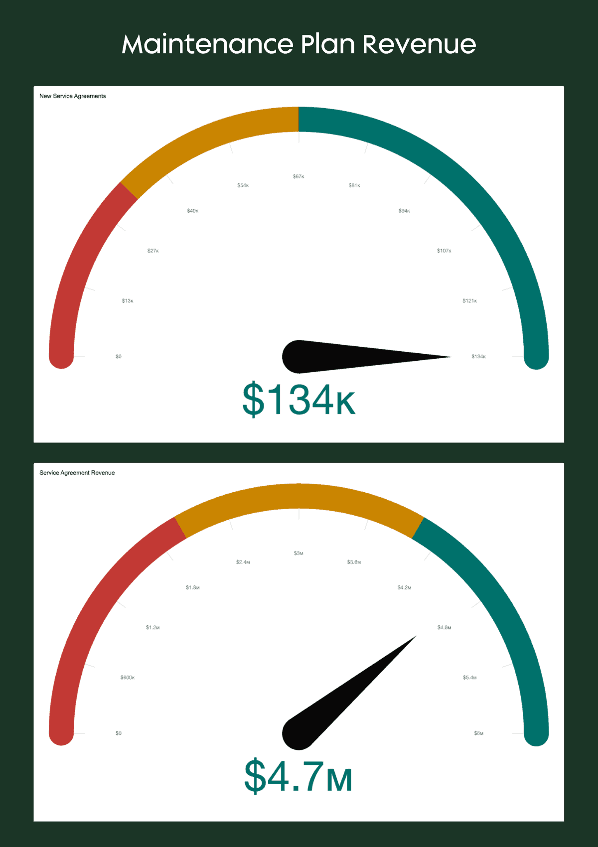
3 - Recurring Revenue from Maintenance Plans
What it is: The annualized revenue tied to service contracts, maintenance plans, or subscription-style agreements that ensure predictable income streams.
Why it matters: Recurring revenue smooths cash flow and stabilizes growth. For executives, tracking this KPI highlights whether field service is building long-term value or running on “one-off” jobs that may dry up. Growth or contraction in maintenance plan revenue also signals customer trust which is a critical measure of loyalty.
Salesforce dashboard components you might consider:
- Bar Chart: Monthly recurring revenue trend (last 12 months).
- Stacked Column: Active contracts by region or service type.
- KPI Tile: % change in recurring revenue YoY or MoM.
- Side-by-Side Gauge Widgets: Compare new service agreement revenue to all service revenue.
Salesforce dashboards can show contract renewal rates, percentage of revenue from recurring vs. one-off work, and maintenance plan churn. In Field Service Lightning, executives can monitor warranty work versus preventative maintenance and see whether proactive contracts are reducing emergency repair calls. Remember that recurring maintenance revenue isn’t just predictable; it’s proof that customers believe in your team’s service for the long-term.
4 - Work Orders Completed On Time
What it is: The percentage of scheduled work orders completed within their planned time window.
Why it matters: Delays push jobs into the next cycle, frustrate customers, and increase downstream costs. Executives tracking this KPI can spot capacity shortfalls, identify regions or teams consistently behind, and make smarter decisions about staffing or scheduling models.
Salesforce dashboard components you might consider:
- Gauge Widget: % of work orders completed on time vs. SLA target.
- Column Chart: On-time completion rate by technician or territory.
- Donut Chart: Past due work orders by region or business unit.
- KPI Tile: Average number of days late vs. target.
With benefits realized from field service features like automated scheduling and Dispatch Console optimization, leadership can see completion rates in real time. Layered dashboards can break down “on time vs. delayed” by technician, territory, or work type, showing leaders where to intervene.
5 - Asset Uptime / SLA Compliance
What it is: The percentage of assets under management that are functioning without downtime, often tied to service-level agreements (SLAs).
Why it matters: For executives, uptime is a direct proxy for customer satisfaction and contract value. Missed SLAs don’t just cost penalties – they erode trust and create churn risk. High uptime shows that preventative maintenance is working and that the service model supports growth.
Salesforce dashboard components you might consider:
- Line Graph: Asset uptime trend over time (e.g., last 6 months).
- Bar Chart: SLA compliance by asset type or region.
- KPI Tile: % of assets meeting SLA target (current month).
Field Service dashboards can track uptime percentages, preventative maintenance jobs vs. reactive break/fix work, and SLA breach incidents. According to Bartek, “for one global Growth Heroes client, shifting the ratio of preventative maintenance to warranty repairs reduced unplanned downtime and extended contract values.”
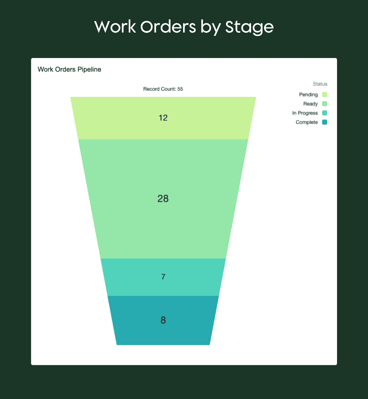
6 - Work in Progress: Open Work Orders by Stage or Region
What it is: A real-time view of all work orders currently in progress, categorized by stage (e.g., scheduled, in progress, completed, delayed) or region.
Why it matters: Executives can’t manage what they can’t see – and in field service, that means visibility into where the work sits today. Tracking open work orders by stage or region gives leaders a quick read on capacity, backlog, and operational flow. It’s a pipeline view for service delivery and it helps leaders anticipate bottlenecks before they turn into missed SLAs.
Salesforce dashboard components you might consider:
- Funnel Visualization: Number of work orders by stage.
- Stacked Bar Chart: Number of open work orders by stage (New, In Progress, Scheduled, Completed).
- Map Visualization: Work orders plotted by region, colored by stage.
- Table Widget: Drill-down list of top regions or branches with most open work orders.
With Salesforce Field Service, executives can drill into real-time work-in-progress dashboards to see how many jobs are scheduled, delayed, or awaiting approval. Filters allow comparisons by territory or technician team, helping leaders balance workloads and improve dispatch efficiency.
7 - Comparative and Trend Analysis: Measuring Improvement Across Teams, Regions, and Time
What it is: An aggregated view that compares performance across business units, regions, or time periods. Rather than focusing on a single metric, this executive lens reveals trends and relationships between key KPIs such as utilization, uptime, and recurring revenue.
Why it matters: Growth doesn’t happen in isolation; rather, it’s the result of continuous improvement across every metric. Year-over-year (YoY) and month-over-month (MoM) tracking helps executives evaluate whether strategic initiatives (like new scheduling automation or technician training) are truly moving the needle. Comparative insights also surface which teams or regions are setting the pace…and which may need support.
Salesforce dashboard components you might consider:
- Grouped Bar Chart: Compare key metrics (e.g., utilization, on-time completion, SLA compliance) by business unit or territory.
- Heat Map: Performance rating by team vs. overall average.
- Trend Chart: Year-over-year improvement percentage by business unit.
Dynamic dashboards make trend tracking intuitive. With filters and historical data views, executives can visualize YoY performance gains and drill into specific teams or geographies. In one of our global deployment projects, unified dashboards revealed that our client’s subsidiaries using standardized processes had significantly higher maintenance plan renewal rates than others which validated the shift toward central governance.
KPIs That Matter
Each of these seven KPIs tells a story – but only when the data is structured, visualized, and shared effectively. The next step for any executive isn’t just tracking the right numbers, it’s ensuring your dashboards make those numbers actionable.
Turning Data Into Decisions: Field Service Dashboards That Actually Get Used
It’s one thing to track the right KPIs, but it’s another thing entirely to make sure those insights actually inform decisions. Most executives don’t suffer from a lack of dashboards. They suffer from too many of the wrong ones.
At many service organizations, we see dashboards start out well-intentioned but end up abandoned because they’re either:
- Built on incomplete or inconsistent data
- Overly complex or too rigid for everyday use
- Disconnected from how the business actually runs
When that happens, your “insight engine” becomes another reporting chore rather than a leadership advantage. Early in many digital transformations, dashboards promise to be the fix for everything…until they aren’t. Before we talk about what great dashboards look like, let’s look at what tends to go wrong first.
The Common Pitfalls of Field Service Dashboards
1. Garbage In, Garbage Out: The number one problem isn’t visualization. Surprise, it’s data hygiene!
When time logs, work types, or regional cost data aren’t standardized, even the most elegant dashboard will tell the wrong story (remember: “you can’t put lipstick on a pig”). One client discovered this the hard way when payroll and job time logs didn’t align – creating “phantom overtime” that inflated costs until Salesforce dashboards exposed the inconsistency.
2. One Dashboard to Rule Them All (Doesn’t Work): Executives, operations leaders, and field managers each need tailored views.
- The C-suite cares about revenue efficiency, SLA compliance, and recurring revenue growth.
- Ops managers want utilization and dispatch balance.
- Field supervisors focus on job completion rates and on-site performance.
Trying to cram all three into one view only creates noise and may lead to disengagement, too.
3. The Zoom Gap: Too many dashboards show the big picture, and NOT the path to action.
Leaders should be able to zoom in (by technician, region, or time) and zoom out (by business unit or trend). When filters or drill-downs aren’t properly set up, users lose confidence in the data and revert to spreadsheets.
While these pitfalls are common, the good news is they’re fixable. The difference between dashboards that gather dust and those that drive daily decisions usually comes down to structure and intent.
What Great Dashboards Have in Common
The best field service dashboards…that is, the ones executives actually use…have three defining traits:
1. They’re built around clean, integrated data. Service, sales, finance, and customer data all flow through one source of truth (ta-dah: Salesforce!). When data lives in silos, reporting becomes a guessing game.
2. They align to business questions, not data categories. Instead of “Work Order Counts by Month,” a better executive dashboard asks: “Are we completing more work with fewer people and keeping SLAs intact?”
3. They bridge operational and strategic decisions. Strong dashboards let leaders pivot quickly with common actions taken such as adjusting staffing, shifting territories, or planning proactive maintenance campaigns.
When these fundamentals are in place, Salesforce dashboards stop being theoretical and start becoming operational which helps every level of your business make smarter calls in real time.
Dashboards That Drive Real Impact
Executives, operations leaders, and field managers need different levels of visibility. A single “mega dashboard” rarely works for everyone. Instead, create role-based dashboards:
For Executives: A “Field Service at a Glance” view could combine revenue growth, SLA compliance, and time-based comparative utilization trends.
For Ops Leaders: Dispatch optimization dashboards that balance workload by region and technician, using live job data and predictive scheduling.
For Field Managers: Completion rate and technician efficiency dashboards that feed coaching conversations and workflow improvements.
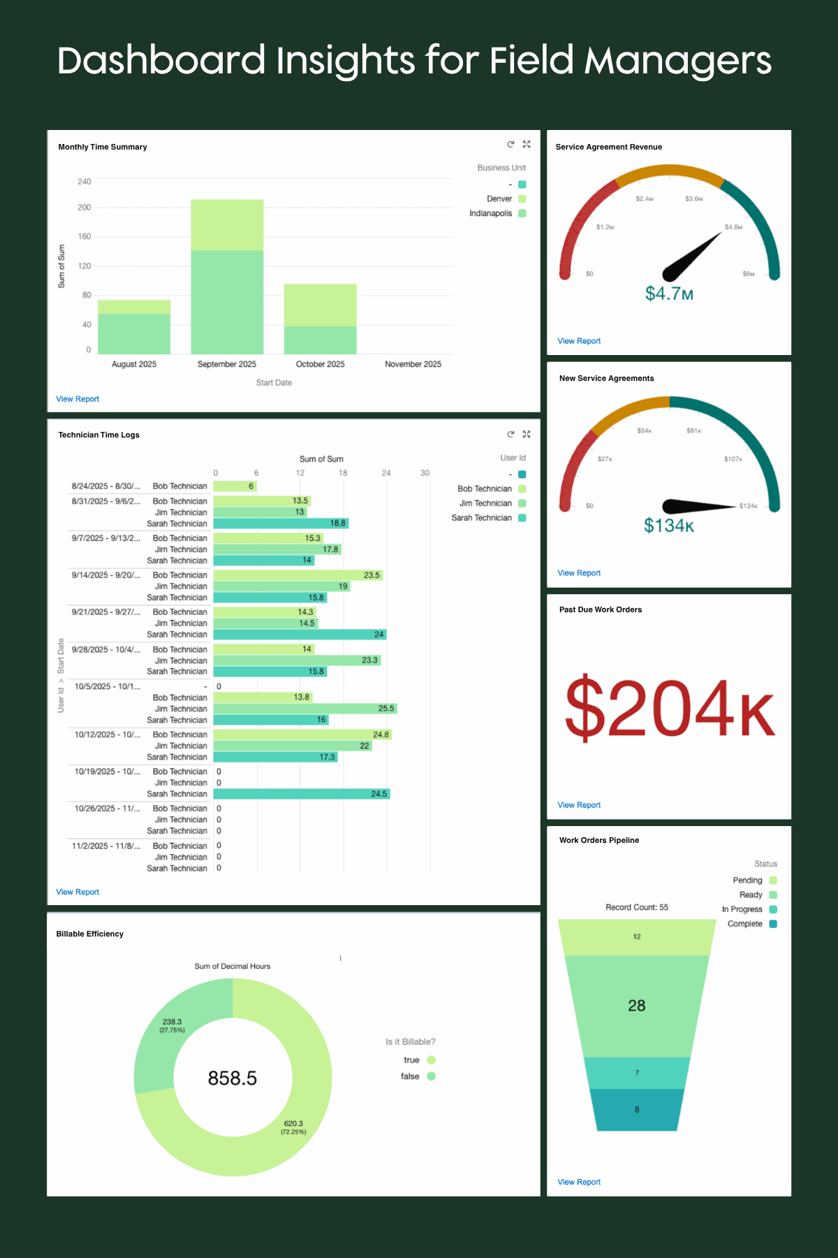
These role-specific views do more than visualize data – they align your teams around a shared understanding of performance. That alignment is what makes Salesforce dashboards indispensable at the executive level.
"A dashboard should never make you ask ‘so what?’ Every metric should point to a clear operational decision."
-Mike Sale, CEO | System Scale
Why Executives Love Salesforce Dashboards (When Done Right)
When data is structured and automated properly, Salesforce dashboards stop being a “back-office tool” and become a real-time performance command center.
Leaders gain:
- Confidence in the accuracy of operational data
- Clarity on where the business is excelling or lagging
- The ability to communicate insights across finance, operations, and service
For example, if you are used to waiting on a weekly report to make staffing decisions, imagine what it would be like to see it on demand…and to be able to act on it the very same day?
When you strip away the noise, great field service reporting isn’t about complexity. It’s about clarity. The key, however, is in knowing where to start, keeping your focus on data you can trust, and building for action (not just analytics).
Approachable Tips for Getting Started with Field Service Reporting
Even the most powerful dashboards are only as good as the data and habits behind them. For executives, that means ensuring your team’s reporting foundation is clean, consistent, and aligned with how decisions actually get made.
Find out where to focus first in the following sections.
Start With Clean, Centralized Data
Before building or overhauling dashboards, get your data house in order. Salesforce Field Service can’t surface accurate KPIs if your data is siloed across spreadsheets, legacy systems, or inconsistent work types.
Align your org structure, work types, and region tags so reports can filter meaningfully by technician, location, or service type. This is the foundation for your “single source of truth.”
Automate Where It Counts
Manual data entry is the enemy of reliable reporting. Automate wherever possible – from syncing time logs to generating work order completions and asset updates. Even small automation wins (like using Flow to track work order completion) can save hours of cleanup each month and drastically improve your KPI accuracy.
Combine Historical Trends with Real-Time Data
The best dashboards don’t just show what’s happening, they show how it’s changing. Year-over-year (YoY) and month-over-month (MoM) comparisons help spot whether recurring revenue, utilization, or SLA compliance are improving or slipping.
Meanwhile, real-time data keeps teams agile, allowing leaders to respond to issues before they escalate.

Prioritize 3 - 5 KPIs Per Role
It’s easy to overload dashboards with every available metric (just because you can!), and that’s where most teams lose traction. Instead, identify the three to five metrics that directly impact performance for each role. If you track too much, nothing gets managed.
Executive Shortcut: Focus on KPIs that tell you whether the business is healthy and scalable. Utilization, on-time completion, SLA adherence, and recurring revenue are good starting points.
Bring It All Together
Implementing these steps doesn’t require a full rebuild, but it does require discipline and clarity. If your dashboards are built on clean data, automated updates, and role-specific insights, they’ll start driving the right conversations across your teams.
That’s how you move from tracking activity to managing outcomes.
Want This Kind of Visibility Into Your Field Service Operations?
Operational visibility doesn’t happen by accident because it’s built through deliberate design, connected systems, and clean data. The companies that master this don’t just track field activity…they anticipate it.
At Growth Heroes, we’ve helped service organizations unify multiple divisions, streamline dispatching, and achieve real-time performance tracking across regions. The result? Fewer surprises, faster decisions, and stronger margins.
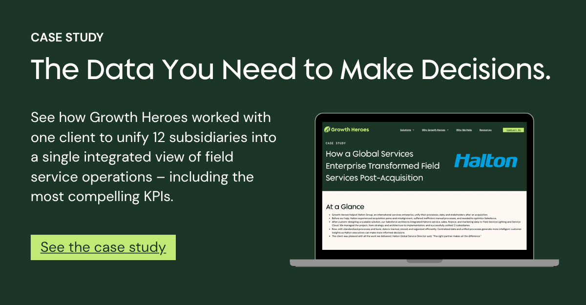
See how one enterprise achieved end-to-end visibility across 12 subsidiaries after a major acquisition, and what their journey can teach your organization about scalable field service management.
Read the full case study
Ready to Grow?
Or, if you’re ready to explore how Salesforce dashboards could transform your operations, schedule a quick consultation with our team.