

As you may have noticed, Growth Heroes has a fresh new look. Our internal marketing team recently rebranded the company to better align our brand identity with who we are authentically and what we do for our clients.
Why rebrand?
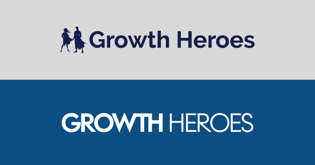
Before, we didn’t have a strongly established brand apart from a wordmark logo and a blue color palette. Because our top priority is always our clients, we also had little time to update our website, establish a brand strategy, or develop a clear vision and plan.
Our branding was previously inspired by the “Heroes” half of “Growth Heroes.” We decided to shift the focus toward what we deliver for our clients: Growth. Whether that means helping a startup scale faster, helping a global enterprise align after an acquisition, or achieving a 5x increase in share price for an employee-owned company, growth is the purpose of everything we do.
Research & brand strategy
At Growth Heroes, we don’t just think of ourselves as run-of-the-mill Salesforce consultants—we aren’t fans of quick fixes or shortcuts. We partner with our clients from strategy to implementation, so we wanted to ensure our brand would stand out in the market.
In our market research, we found that many other Salesforce consultancies’ brands look and feel similar, often using a blue color palette derived from the Salesforce brand. We saw an opportunity to do something a little different. When considering our brand voice, we knew we wanted to sound personable and use plain language, limiting buzzwords and overly technical language when possible.
Brand concept drivers
Through a content audit of our old website & discovery discussions with the team, we identified essential concepts to express throughout our new brand and website. We distilled our important themes into the following ideas that inspired the brand design:
Growth, transformation, & improvement
Growth is the purpose of our work, so it became the key theme of our rebrand. Digital transformation brings results for our clients, measurably improving their businesses through key metrics we identify together at the start of each project.
Making things easier & better
Our work saves clients time and headaches from tedious manual tasks. We aim to reduce stress by making things easier, utilizing strategy and technology to achieve better results.

Modern & tech-forward
Along with setting up and optimizing the #1 CRM, we work with an integrated suite of industry-standard tech tools so our clients can be confident they’re getting the best solutions possible for their complex business problems. Our branding needed to reflect a modern, tech-forward team.
Helpful, trustworthy & approachable experts
Building trust is the most essential part of our work. We always do what’s right and fair to our clients and team. When clients partner with Growth Heroes, they get a team of digital transformation experts and plenty of face-to-face time with us through weekly meetings and regular updates (and more, if the project requires). Likewise, we knew our brand would need to feel approachable and trustworthy.

Consistent, comprehensive, & unified
One of the primary benefits of digital transformation is that all of a business’s core processes and data can be integrated into one unified, comprehensive platform. Our new Growth Heroes brand needed to feel consistent and unified to match.
Excellence, impact-focused
We pride ourselves on delivering results for our clients and demonstrating measurable impact through clear KPIs. This focus should be evident in the quality of our new brand identity.
The new Growth Heroes brand
Through collaborative working sessions, our marketing team developed multiple concepts before we all aligned on a new look for Growth Heroes that felt perfectly authentic to our team, our purpose, and our work with our clients.
Our new logo
Our Supera Gothic typeface, used in previous iterations of the Growth Heroes logo, feels more friendly and modern in title case instead of all caps. The negative spaces of our leaf icon reveal a bar chart showing consistent growth.
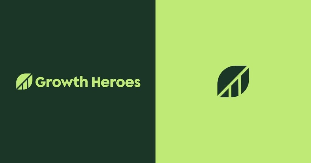
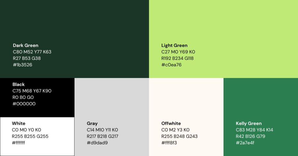
Our new color palette
Green represents growth and profitability. In color psychology, green also signifies renewal and abundance. A dark green pulled from the Salesforce palette is the foundation of our brand. In addition, the primary palette includes a monochromatic collection of green shades and an eye-catching accent color that feels friendly and tech-appropriate.
Our colors were also engineered to ensure WCAG 2.1 AAA accessibility compliance, with sufficient contrast to ensure readability for as many people as possible.
Our new brand typography
Supera Gothic is a rounded, geometric typeface that feels modern and approachable. This headline typeface is a continuation of the previous Growth Heroes wordmark.
DM Sans is a simpler font with the same characteristics — rounded, geometric, and friendly. We use this typeface for supporting and body copy.
DM Mono is the monospaced typeface in the new Growth Heroes call-to-action (CTA) buttons and accents. This detail helps our CTAs stand out and adds interest while keeping the brand cohesive. It’s also a subtle nod to the monospace typeface used when developing code.
Our new brand icons & illustrations
Leaf motifs and callouts add visual interest to our graphics and layer over images. A consistently styled icon set includes symbols representing our service areas and more. Our core values even have their own set of branded icons.
Our new brand photography
Before our rebrand, our website felt impersonal and lacked imagery of people — the heart of our business. We added bright, modern photography featuring friendly professionals representing our clients and our team. A new headshot direction showcases Growth Heroes team members with plants in the background as a nod to our focus on growth.
Our new website
Once we agreed on an exciting new brand concept, we brought it to life with a new website. We strategically planned out our new sitemap, prioritizing the user experience and what information our visitors are looking for at each stage of their journey. Our marketing team thoughtfully overhauled our website’s content, carefully choosing every word and developing each page design with intention.
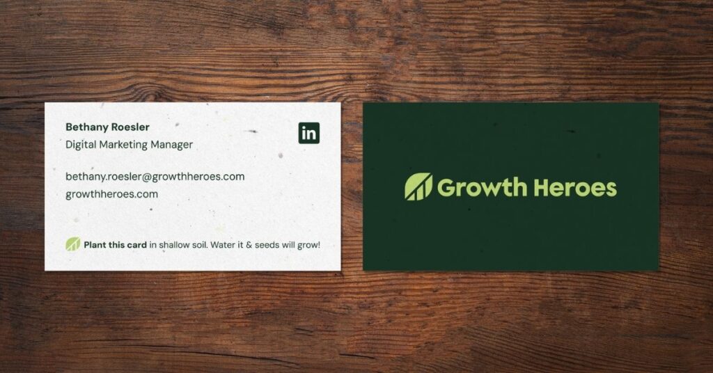
Our new business cards
Next, every Growth Heroes team member received a set of sustainable, seed paper business cards to give away. When planted in shallow soil and watered regularly, these cards will grow wildflowers!
What’s next for Growth Heroes
Our team has big plans and more exciting things in the works for the Growth Heroes brand, prioritizing client appreciation and excellent brand experiences. This is only the beginning of the new Growth Heroes, and we’ll continue to build our new website, share the incredible results of our partnerships, and more. We’re excited to continue partnering with our clients to digitally transform their businesses and create measurable growth.